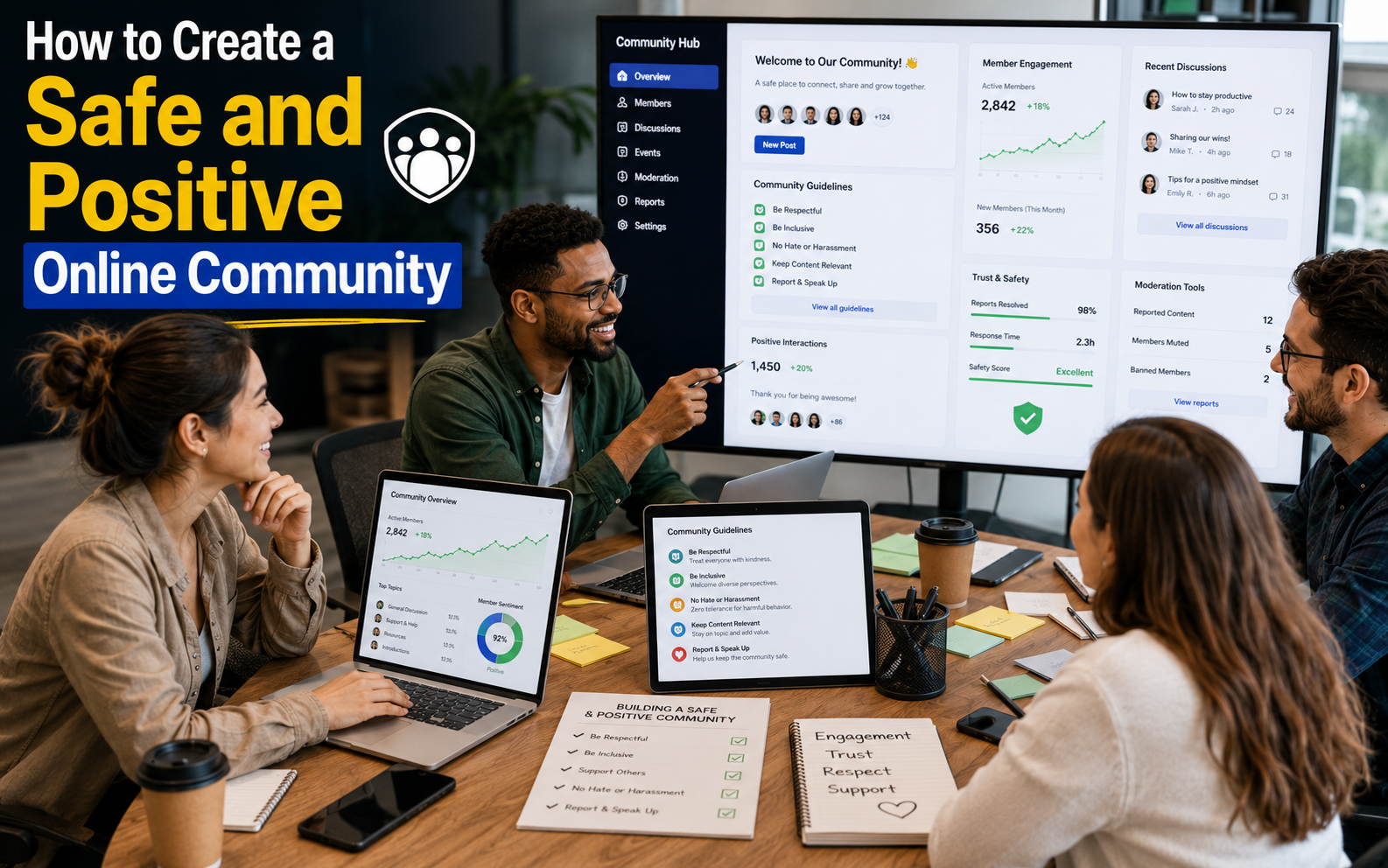
High-performing communities start with deliberate community website design: sites that prioritize members, make information easy to find, and invite participation see higher retention and activity. In this guide you’ll get practical steps to improve your community experience, from defining goals to quick wins you can A/B test this month.
Since Salesforce introduced Community Cloud (now Experience Cloud) in 2013, organizations and online communities have adopted purpose-built tools and patterns to scale member engagement and streamline moderation. A thoughtful, well-structured site signals value to new members on their first visit and sets expectations that encourage return visits and ongoing contribution.
Turning a static page into a living hub requires focusing on a few high-impact elements clear navigation, personalized content, and lightweight interactive features. Those targeted customizations improve user experience for members and make it easier for community managers to measure success.

Key Takeaways
- Community website design focused on members drives stronger connections and repeat visits.
- Small, targeted customizations navigation, personalization, and interactive elements boost member engagement.
- Salesforce’s Community Cloud (Experience Cloud) helped mainstream community platforms after 2013; use platform features strategically.
- A clearly structured homepage and information hierarchy make members feel welcomed and valued.
- Benchmark your site against top community sites and run simple tests to prioritize improvements.
Defining Your Community Website Design Vision
A clear vision is the first step toward a thriving community. Your community website design should be driven by specific goals that reflect both your organization’s priorities and what members want to accomplish. Those goals act as the north star for every feature, layout decision, and content plan.
Industry research underscores this focus: a 2022 CMX report found that 85% of organizations say prioritizing member engagement is critical to long-term strategy, so establish measurable objectives early to guide investment and staffing.
Use this quick vision checklist to make your goals actionable:
- Business goals: What outcomes does your organization need (lead generation, retention, support load reduction)?
- Member goals: What do members expect (networking, learning, product help)?
- Success metrics (KPIs): DAU/MAU, posts per member, retention rate, time-to-answer.
- Desired behaviors: What do you want members to do (ask questions, help others, attend events)?
Example: a professional association may prioritize networking and continuing education (members want events and member directories), while a product support online community will focus on fast answers and searchable documentation. Mapping those differences up front guides navigation, content priorities, and personalization rules.
Aligning your vision with member needs creates a sustainable environment where members feel seen and stay active. If you want a ready-to-use template, download a one-page vision worksheet to document goals, KPIs, and a 90-day test plan.
Key Principles of Community Design
Effective community design begins with intentional user experience: designing for how members actually behave, not how you wish they would. Prioritizing UX reduces friction, increases time-on-site, and makes it easier for users to discover value. According to the 2023 State of Community Management report, 60% of communities customize their CSS or visual layer to better reflect brand and improve the community experience.
Below are three practical principles with tactical examples you can implement quickly:
| PrincipleDescriptionBenefit | ||
| Anticipate User Needs | Use data and member research to surface likely intents—add topic filters, highlight trending questions, and implement smart search autocomplete so users reach answers faster. | Improves retention and engagement by reducing time-to-value. |
| Custom CSS & Visual Design | Apply brand colors, readable typography, and consistent UI patterns (cards, badges, post types) so members recognize trusted content and navigation areas. | Creates a memorable, trustworthy experience that supports member recognition and trust. |
| Intuitive Navigation & Access | Organize content by common tasks (Ask, Learn, Connect), use clear labels, and ensure important links are reachable in two taps/clicks; follow basic WCAG contrast and focus rules for accessibility. | Reduces frustration, increases participation, and makes the site usable for more people. |
- Anticipation: run a short survey or review search logs to identify top intents in 1 week.
- Design: test a small CSS theme update on a beta group before global rollout.
- Navigation: map primary user journeys and ensure each is <= 3 clicks from the homepage.
Watch this short walkthrough for examples of these principles in action:
(opens a 4–6 minute demo highlighting layout and navigation patterns).
Enhancing Member Engagement Through Customization
Interactive features are one of the fastest ways to increase member engagement and turn passive visitors into active contributors. Tailored customization small product changes that meet member needs encourages daily activity and makes the community feel more useful and welcoming.
Note on examples: enterprise chat tools like Slack (founded by Stewart Butterfield in 2009) show how lightweight, realtime interactions scale engagement; while Slack is not a forum platform, its emphasis on reactions, threads, and integrations demonstrates patterns you can borrow for community sites to support people who want fast answers and group collaboration.
Practical interactive features to test (pick 3 for a 30-day trial):
- Reactions & upvotes — let members signal helpful content quickly.
- Polls & quick surveys — drive short-form participation and collect feedback.
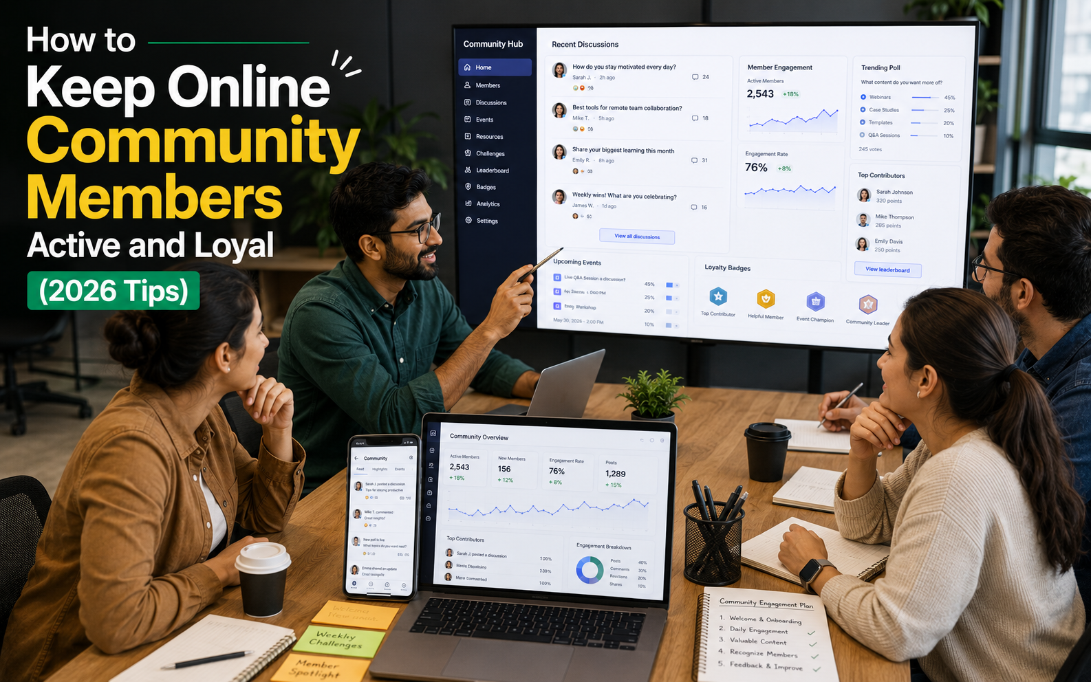
- Badges & reputation points — reward repeat helpful behavior and surface trusted members.
- Featured posts & weekly digests — highlight high-value content to increase visibility.
- Q&A with accepted answers — reduce time-to-answer and build a searchable knowledge base.
Incentive ideas that work across communities:
- Virtual badges and profile ribbons for milestone contributions.
- Featured member spotlights in newsletters or homepage carousels.
- Leaderboards or monthly recognition for top helpers (use sparingly to avoid unhealthy competition).
Implementation tips and KPIs for A/B testing:
- Start small: roll out a feature to a beta segment (5–10% of active members) and track DAU/MAU lift, posts per member, and retention at 7/30 days.
- Measure engagement quality, not just quantity: track replies per post, time-to-first-answer, and percent of questions marked solved.
- Compare a chat-style flow (Slack-like) vs. a threaded forum (Discourse-style) on a small scale to observe differences in activity and discoverability.
Choose three interactive features to test this month and measure DAU, posts-per-member, and retention to determine which customizations deliver the best ROI for your community.

Essential Elements of “community website design”
A clear layout is the backbone of any thriving community: it shapes how members discover content, join conversations, and return to the site. Thoughtful page structure reduces friction, makes information easy to find, and directly improves the overall community experience.
Platform examples show the impact of flexible layout systems for example, Discourse (launched by Jeff Atwood and team) powers thousands of community sites by offering configurable layouts and navigation patterns that adapt to different use cases. Choose layout and navigation patterns that match your community’s goals, not just what’s trendy.
Choosing the Right Layout and Navigation
Design navigation to solve common member tasks: find answers, connect with people, and discover useful content. Aim for a homepage that prioritizes those tasks and a menu depth that doesn’t exceed two levels for most journeys.
Layout audit checklist (quick):
- Homepage priority: top 3 actions clearly visible (ask, browse topics, join events).
- Menu depth: keep primary nav under two clicks/taps for core journeys.
- Search prominence: visible search box with autocomplete on every page.
- Content hierarchy: use headings, cards, and CTAs to show what’s new, popular, and recommended.
- Mobile-first layout: ensure the primary action remains reachable on small screens.
Personalization Strategies for Online Communities
Personalization helps surface relevant content to each member and increases time spent and satisfaction. Focus on lightweight, privacy-respecting tactics that add clear value.
Practical personalization tactics:
- Topic follows: let members follow topics or tags and surface followed content in a “For you” feed.
- Recommended posts: use simple heuristics (recent + upvotes + topic match) to suggest posts on the homepage or in digests.
- Role-based sections: create areas or filters for members with shared attributes (mentors, new members, professionals) so users see the most relevant resources.
When to use topic-first vs. people-first navigation:
- Topic-first: best for knowledge or product support communities where content discovery (how-to, docs, solutions) is primary.
- People-first: ideal for professional networks or communities centered on mentorship and networking where connections and profiles matter most.
Implementation tip: run a quick wireframe test swap the homepage hero between “latest topics” and “featured people” for 2 weeks and measure clicks to key actions, time-on-page, and new-member signups.

Improving User Experience on Your Community Site
Improving user experience is one of the highest-impact investments for any community. A responsive, accessible community website ensures members can find content, ask questions, and participate whether they’re on desktop or mobile reducing friction and increasing return visits.
Use this compact UX checklist with measurable targets to guide changes and tests:
- Page load: aim for a first contentful paint under 2.5s and keep page weight lean to reduce drop-off on mobile.
- Tap targets & spacing: maintain 44–48px touch targets and ample spacing so users can interact comfortably on phones.
- Readable typography: base font size 16px for body, 1.4–1.6 line-height, and clear hierarchy for headings so content is scannable.
- Search & discoverability: place a prominent search box (with autocomplete) on every page to help users find information fast.
- Contrast & accessibility: meet WCAG AA contrast ratios, include meaningful alt text for images, and ensure keyboard navigation and visible focus states.
Example micro-case (before → after): a community homepage with long lists and small fonts saw 18% higher bounce; after simplifying to three priority actions (Ask, Browse Topics, Join Event), increasing font size, and adding search autocomplete, clicks to key actions rose 32% and time-on-site improved. Use small experiments like this to prove impact.
Quick implementation pointers:
- Responsive breakpoints: design for mobile-first, then scale up (common breakpoints: 360px, 768px, 1024px).
- Image optimization: serve properly sized images and use modern formats (WebP) to reduce payload.
- ARIA basics: add roles for navigation regions, label form elements, and expose dynamic updates (live regions) for assistive tech.

| AspectDescriptionBenefit | ||
| Responsive Design | Adapts to various devices with mobile-first layouts. | Higher engagement and inclusivity for users on all devices. |
| Easy Access | Search, clear CTAs, and prioritized content. | Faster task completion and fewer frustrated users. |
| Prioritizing Accessibility | WCAG-forward choices and ARIA hints for assistive tech. | Broader participation and legal/responsibility alignment. |
Best Practices for Online Community Management
Running a healthy online community requires a repeatable management approach: clear policies, regular content curation, consistent moderation, and data-driven iteration. When you treat community management as an active practice rather than a set-and-forget task, members feel safer, content quality rises, and engagement improves.
Start with these core best practices:
- Define moderation rules and roles: create clear guidelines and assign moderators (paid or volunteer) with documented escalation paths to keep discussions constructive.
- Curate high-value content: surface expert answers, canonical threads, and evergreen resources so newcomers and members find value quickly.
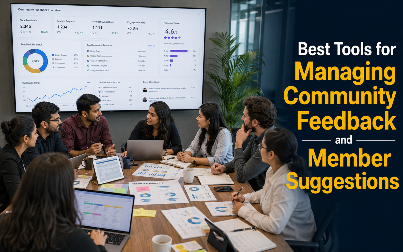
- Use data to iterate: track engagement metrics and member behavior to prioritize improvements and prove impact.
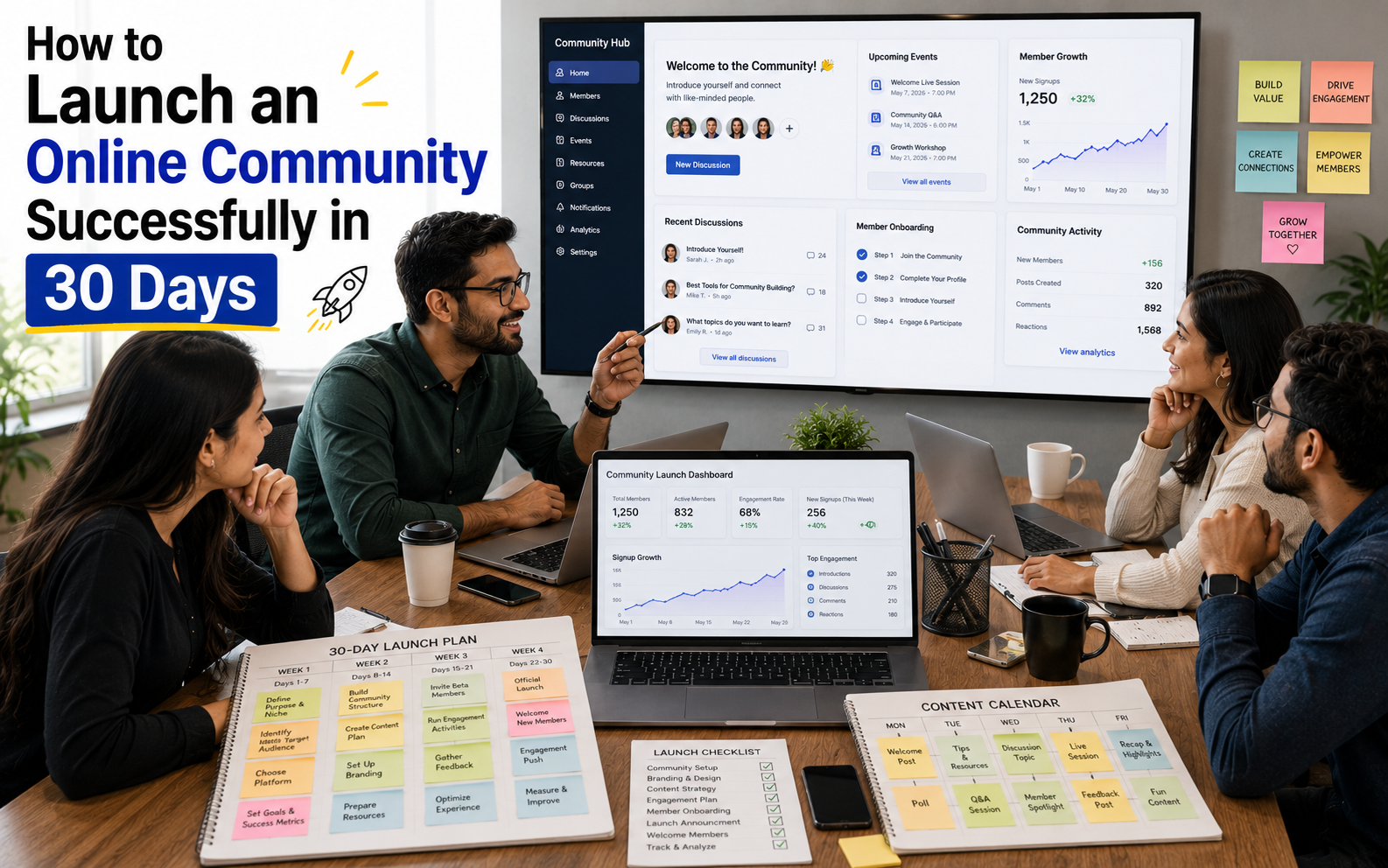
30-day community management playbook (quick):
- Week 1 — Audit: review top pages, recent posts, and moderation queue; identify 3 content gaps.
- Week 2 — Clean up & curate: pin/highlight canonical posts, close duplicate threads, and prepare a weekly digest template.
- Week 3 — Policy & training: update moderation guidelines and run a short training for moderators; add a clear reporting flow for members.
- Week 4 — Measure & test: launch one engagement experiment (e.g., weekly AMA, badge program) and track KPIs for 14–30 days.
Key metrics to track and suggested tools:
| MetricWhy it mattersTools | ||
| DAU/MAU | Measures active engagement and overall health | Google Analytics, Mixpanel, platform analytics |
| Posts per member | Indicates contribution level and community vitality | Platform reports, SQL queries |
| Time-to-answer | Critical for support communities—lower = higher member satisfaction | Zendesk, platform analytics |
| Content quality (flags/resolutions) | Shows moderation effectiveness and content trustworthiness | Moderation dashboards, manual sampling |
Practical moderation & curation tips:
- Assign moderators to theme-specific queues so expertise stays focused.
- Use templates for common moderation responses to keep messaging consistent and scalable.
- Schedule regular “content refresh” sessions to update pinned resources and remove outdated links.
Use the playbook above as a living process: iterate every 30–90 days based on data and member feedback. For a quick starting point, run the audit in Week 1 and prioritize one curation and one engagement test to drive immediate improvement in member engagement.
Incorporating Modern Design Trends for a Vibrant Community
Adopting current design trends helps your community feel modern and welcoming while highlighting the core value your site delivers to members. Thoughtful visual choices beyond pure aesthetics make it easier for people to connect, scan content, and take action.
Four practical trends to consider:
- Micro-interactions: subtle animations for likes, follow buttons, and loading states that provide immediate feedback and make the site feel responsive.
- Motion & transitions: smooth, purpose-driven motion (e.g., gentle card lifts, content fade-ins) to guide attention without distracting users.
- Expressive imagery and storytelling: use real member photos, case snapshots, and short visual narratives to communicate community value and invite participation.
- Accessible typography & layout: prioritize readable fonts, clear hierarchy, and generous spacing so content works for everyone and improves the overall experience.
Do/don’t example (visual approach): do use a concise hero with a clear CTA and representative imagery; don’t overload the hero with long paragraphs and multiple competing CTAs that confuse new members.
Tip: collect 6–8 homepage screenshots from top community sites to build a quick inspiration gallery and pick one trend to test visually for 30 days.
Advanced Strategies to Help Users Navigate Your Website
Good navigation is a multiplier: a clear homepage, well-placed buttons, and logical navigation reduce friction and increase how often users find and interact with content. Small changes to the homepage layout and button placement can deliver outsized gains in engagement and satisfaction.
Mini-checklist for homepage and navigation priorities:
- Homepage priorities (top 3–5): primary CTA (Ask / Start a Topic), featured content, search, and a clear way to join or sign in.
- Primary vs. secondary nav: keep core journeys (Ask, Browse, Events, Members) in the primary nav; move utilities (Help, Settings) to a secondary menu.
- Search prominence: visible search with autocomplete and filters on every page to boost content discovery.
Two effective button-placement patterns:
- Hero CTA pattern: Place one clear primary button in the hero (text: “Ask a question” or “Get started”) and a subtle secondary button (“Browse topics”) this increases clicks to key actions and reduces choice paralysis.
- Sticky action bar: a bottom or top sticky bar with contextual buttons (New post, Search, Notifications) improves accessibility on mobile and raises conversion for content creation.
Quick A/B testing plan:
- Test A: hero with primary CTA “Ask a question” vs. Test B: hero with primary CTA “Browse topics.”
- Run for 14 days on similar traffic segments and measure clicks on the CTA, time-on-page, and posts created.
- Preferred metrics: CTA click-through rate, posts-per-visitor, and new-member signups.
Button copy tips: use task-focused verbs (“Ask,” “Share,” “Join”) and keep labels under 3 words for clarity—this improves discoverability and encourages users to take action.
Conclusion
Building a thriving community is an ongoing process that requires regular refinement, measurement, and a relentless focus on members. Prioritize the user experience, test targeted design and engagement changes, and iterate based on data and member feedback to steadily improve participation and satisfaction.
Quick recap of action steps:
- Define clear goals and KPIs (DAU/MAU, posts per member, time-to-answer).
- Prioritize homepage and navigation changes that reduce clicks to key actions.
- Test 1–3 interactive features (reactions, polls, badges) and measure impact on retention.
- Run a 30-day content curation and moderation playbook to improve content quality and trust.
We recommend downloading the community health checklist to run your first 30-day audit (goals, content, moderation, and quick tests). Start small, prove impact with metrics, and scale what works.
FAQ
What is the importance of a well-structured community site?
A well-structured community site helps members find value quickly and fosters meaningful connections. Quick wins: simplify the homepage to the top 3 actions, add visible search, and feature canonical posts so new members feel guided.
How can I identify my members’ engagement goals?
Interview a sample of members and review search and post data to uncover common needs. Action: map member intents into 3 categories (Learn, Connect, Solve) and set one KPI for each to measure progress.
What are the key principles for enhancing user experience?
Design for real user journeys: anticipate needs, make navigation intuitive, and ensure accessibility. Immediate steps: run a navigation audit, improve contrast/typography, and add autocomplete search to speed discovery.
How can interactive features boost activity on my platform?
Interactive features (reactions, polls, Q&A, badges) lower the barrier to participation and create feedback loops that encourage repeat visits. Try a 30-day test of three features and track DAU, posts per member, and retention to see what drives real engagement.
What layout and navigation strategies should I consider?
Choose navigation that reflects member priorities—topic-first for knowledge centers, people-first for networking sites. Keep primary actions visible on the homepage and limit menu depth to two levels for most journeys.
Why is responsive design essential for my site?
Responsive design ensures all members can access content regardless of device, which increases inclusivity and reduces friction. Action: adopt mobile-first breakpoints and measure mobile engagement separately to identify problems.
How can I maintain high-quality content in my community?
Maintain quality through regular curation, clear moderation policies, and data-driven content updates. Practical step: schedule weekly curation to pin canonical answers and run monthly moderation reviews to refine guidelines.